Tuesday, February 27, 2007

CREATIVE PACKAGING DESIGN

Visual design can be defined as we walk on a street when we see something make us "astonished 200%", that is a successful visual design. Let's talke about packaging design; For me, I prefer creative, fresh designs which can draw my attention for a long while, but ironically bad designs also stunned me a long while.


Take a look at the Hersey's package of Valentine's Day chocolate. I'd say it's an awesome design because the creator combined similar package as
Durex's products (take a look w/ hyperlink then you know that^^ ). The shining purple style added with shape of heart, attracting buyers to be willing to take out the money from their pocket to buy it. It's a beautiful visual design style of color combined with other product of Durex company.


Another view of my defining viusal design style is " love at first sight" presented by Amore Co. which is doing great on inspiring identities that match human interests and encourage customer participation. As you see the packaging design of Amore, you will love it without any thought. Visual design style is a style that combined with " passion design and creative design", see the pictures as below you will understand what is " love at first sight" which is also a business goal of Amore Co.


Wednesday, February 21, 2007

Image magic

Dots create a line, lines create a surface, several surfaces create an image. With an image, thousands and thousands words can be embraced entirely. Image is constituted by people, thing, object, color , hue and imagination of viewer. Different image can be defined as defferent point of view or aspect, and also a product can be design as an art as an image in which views can realize throughout . In conclusion, image has a function to transmit a frame of mind.

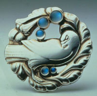
A good example of an art as product I am here discussing about is Georg Jensen's goods which also can be defined as a work of art. His goods present meaningful image inside, especially his classic design of "outstanding pigeon that gives birth to".

Only seeing names, it is difficult to understand the reason, its brand discerns that degree is extremely high. This brooch is for brand, there is a meaning with special one story. The outstanding pigeon that gives birth to is a more naturalistic work, and this design I would call it an image which expressed that pigeon is a meaning of peaceful even more, it expessed that pigeon brougt a message with peace to tranmit to every corner and human being expect the peace of the world is coming.

The pigeon image or icon presents the idea of PEACE, moreover in his design of art with other piece of work also presents other different meaning in his image which can be described as Image Magic.

Ref.http://www.georgjensen.com/gj/flash/brand/brandPage.html

Sunday, February 04, 2007

Web-based Typography Design

Visual contacts brings audience to be more confident to believe something, and it is a stratey of web pages designers they use the visual elements to seize audience's more attention. Good typography is also an important aspect on designed web pages as any other medium. As you can see, people don't want to spend a lot of time surfing on the Internet reading web pages which are dull and unattractive, they will close the pages then open another ones.

When a reader scans web pages, they are looking for information fast. THe designer can make it easier for people to find the information they need if it is presented in a logical manner. Any page of text starts out as a solid block of type. Bearing in mind the natural top-down flow of reading, certainelements of importance need to be given visual emphasis. In typography, all elements are only relative to one another ,and this is one of the underlying principles of HTML type mark-ups. Other apects of design are like type size, weight, italics, underline, color, position and space. But if you want to make web pages more creative, you need use a deal of techniques to prioritize ubfirnatuib little imagination can prove fruitful and be visually rewarding.

Unfortunately the number of typefaces we can now choose from is still somewhat limited to the most basic set because of OS or browser. About the font, Times, still the most popular option, is an excellent typeface for printing newspapers, but is is a pain for reading on screen( my opinion). Its original version was designed to squeeze as many letter as possible on a printed page and still remain legible. Therefore its print version has a medium while being fairly narrow, with sharp and small serifs. Its small ascenders and descenders make it very economical, because they reduce the need for leading, enabling the typesetter to set more lines per page. And here is the web I think the best- SONY.